


Descent: Journeys in the Dark (Second Edition) | Heroes
- Kenneth Tan
- Feb 2, 2016
- 5 min read
Updated: Jan 9

I’m trying to get my miniatures painted, and I'm starting with the hero miniatures of Descent 2nd Edition! Some are out of shape and I'm trying out the “hot water” trick, but it isn’t working too well. These miniatures are 1-2 cm smaller than the Reaper Miniatures, so let's see what I can do with them

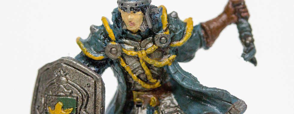
The illustrators did a great job matching with the 3D modelers. As far as the piece goes, I’m pretty happy with it. At a glance, the hair should’ve been more orange, the green should’ve been leafier, and the boots should have been tanner.


I also notice that mold lines were present only after painting. I should've gone through the miniature thoroughly before starting. They were tiny and I was pretty unobservant. I paid more attention to the tiny details of the belt buckles and the leather boots and straps.
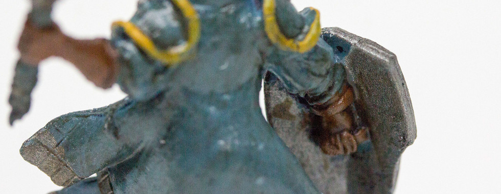
They came out really nicely, though you can tell the wash kinda pooled in wherever it did. Might’ve been overdone, from the looks of it. The centre buckle piece could’ve been better, but I didn’t have gold paint at this point and went ahead with yellow.

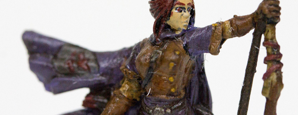
From the get go, some of my colors are too dark. Her purple is fine, but her hair should be redder, her skin should be whiter, and her gauntlets and boots should have a shade more yellow in them. I’m not sure why I’m not observant about the tone of the color until this process, but it’s probably a good thing that I started this reflection if it helps me really see what’s going wrong.


There doesn't seem to be much problems with this piece. I still can't do eyes, and the fabric is generally flat without proper highlighting techniques or washing. My painting's improving. Slowly but surely.
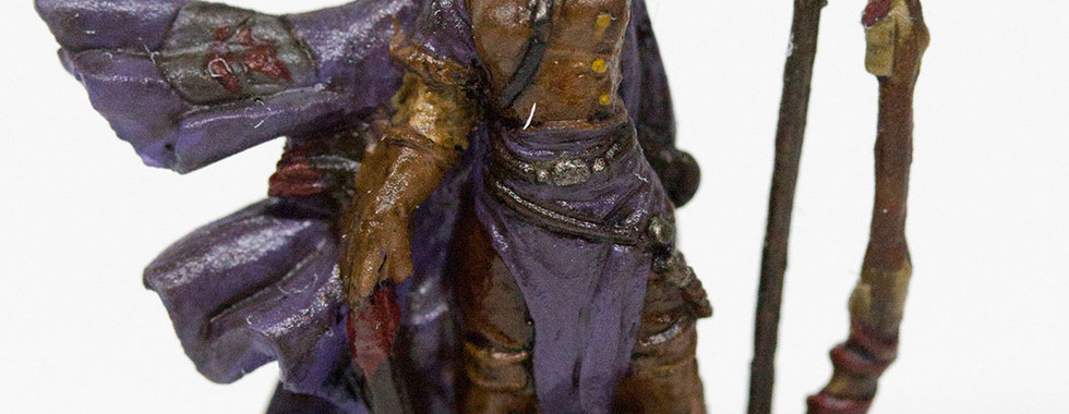
I learnt that painting strokes along the fabric is important to show flow. The differentiation between armor and cloth came across quite cleanly too. The insignia on the cape reminded me of the Attack on Titan emblem. It’s really complicated from the reference picture, and I should probably have used more silver.

One thing I notice about most of the miniatures is that they look good from a normal viewing distance. The more I review them with my macro lens the more flaws I see. It's slightly disheartening, but should not show up during play.


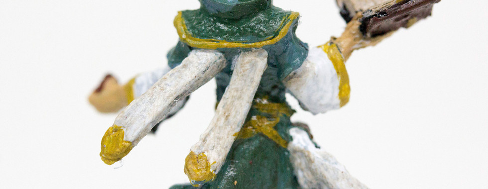


I didn’t have gold paint when I started this, so the trims around his neck and belt buckle were just yellow. There was less color variation here, but a lot more detail work. This figure started teaching me accuracy, which took me some time to get right. The miniature was too small for some details to be printed properly, so I ended up drawing most of it by hand.
I also custom blended the turquoise, which I think was more or less correct. However, Agrax Earthshade (Citadel’s most versatile choice of shade for me) muddied most of it, giving the body a darker, dirty look. Don’t be afraid to eyeball your mixes. Try out weird combinations and you may be able to come up with cool results.

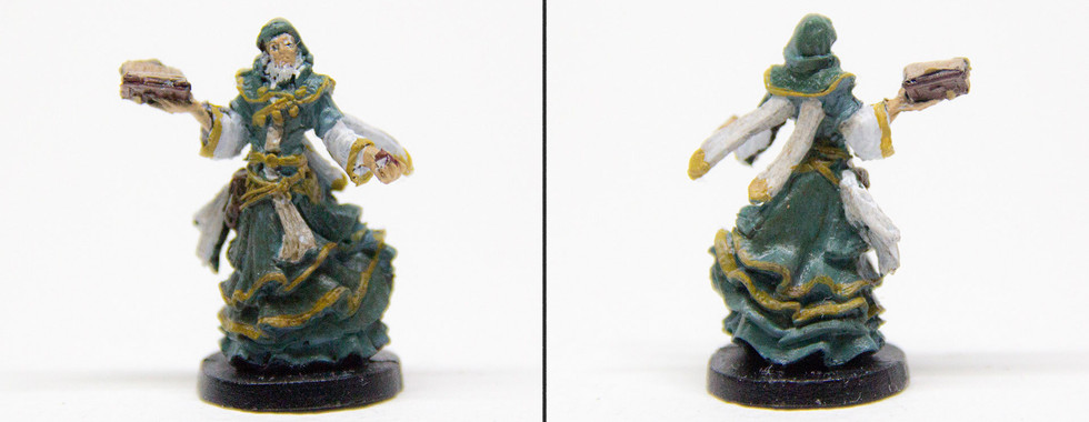
I never realized this hero was female until I observed the chest ornaments close up. It makes sense that they try to balance the genders in the heroes. This is only hero with green skin, kinda feels like the token colored character.


It’s cheating, but the eyes are hidden by her skull, so I didn't need to put so much work to make it look good. The coat’s white lining was drawn by hand, and some details were added by me. The reference for example, didn’t show the hair color, so I winged it and used a nice leather brown.

So not only are the Descent miniatures smaller than the standard, they have a halfling. I braced myself for a lot of squinting.

I feel that Descent Heroes use a lot of brown in their color scheme. Despite the base coat being different colors, the accents and details are mostly brown. This character uses 4 different shades of brown.


I posed my thumb beside this miniature just to show how tiny it is. It took longer for this miniature just because I had to pay so much attention to the smaller details. I dropped all my brush sizes, and I became cross-eyed after this piece.
Amongst the heroes, this is my favorite. The colors are nice, and the details are clean. Although, we’ll have to wait for the closeups again. Upon final check, I used more Teal than Turquoise, as the reference picture. Mixing colors is hard.


Love the colors. I should've worked on the shield a bit more. The details were miniscule, and I only managed the emblem, despite there being more details.

In general, reds are very close to brown, so I faced the same problems I did with the halfling.


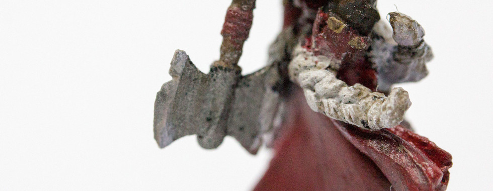


I highlighted the axe edge in white to give it the illusion of reflection. I think I should've made the skin slightly pinker. Otherwise, it came out decent.

This was the most difficult mini of the list by far. It might be because of all the details, or the colors blending into each other.


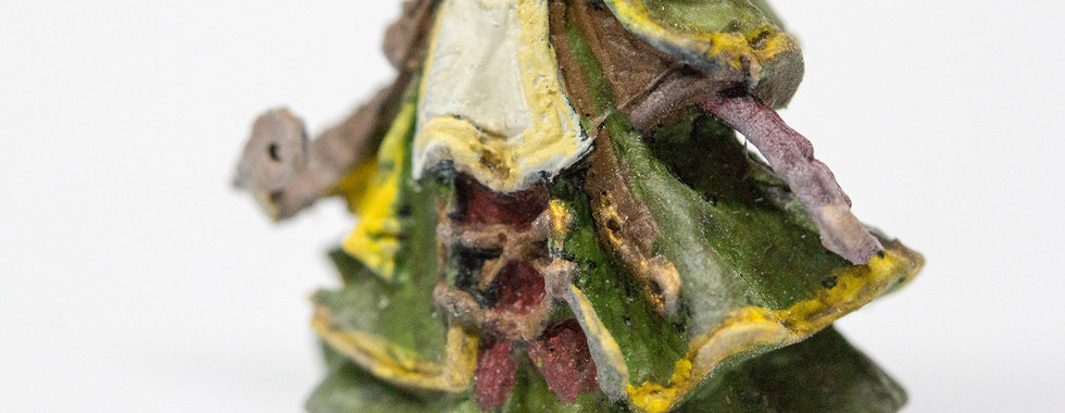


The paints came on a little thick because of how many layers I put on. The clothes overlapped each other, so it was slightly harder, balancing between red, brown, white, yellow. There was also a printing error, where holes were on his face. Factory issue that could've been fixed with a tiny bit of green stuff?

For these last two, I had the foresight to now take before and after picture. So at least you'll get to see the miniature primed, then painted.


I dislike this miniature. His right arm is popped out, and the details were not fantastic. The posing isn't good either, considering the reference made him look so suave.

This mini was simple and distinct. Enjoyed this piece quite a bit.


The most interesting part of this miniature was the shield. I ended up mixing my own brown-yellow-black shade for this, and if I can say, it looks great. I didn’t know how to highlight metallics, and wasn’t sure if gold and white would’ve mixed, so I didn’t go there.
FINAL THOUGHTS
These are the first ever miniatures I've ever done. There are masterful interpretations out there, and mine are not. It's slightly disheartening, but I know I will get better, and it's about consistency and passion for the hobby.
I'm improving visibly and I'm happy with these tabletop standard for now. My group will love these painted miniatures when we play. For the time being, I need better lighting and magnification, because I can't seem to see what I'm painting properly, and the colors are not coming out right either.
Till the next post! Thanks for staying.

Comments